01 — Case study
Hoorleen
Matchmaking that respects privacy.
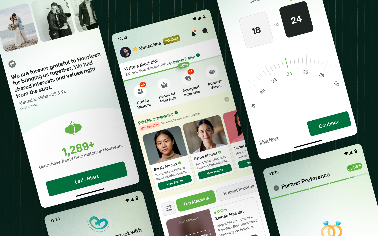
Research-led UX for a matrimonial app built for Muslim communities in Kerala - designed around privacy, family trust, and intent rather than endless swiping.
The problem
Matrimonial apps in India mostly borrowed their patterns from dating apps - swipe, match, chat. For Muslim families in Kerala, that model breaks immediately. The search is intentional, it often involves family, and privacy isn't a setting people toggle on. It's the entire premise.
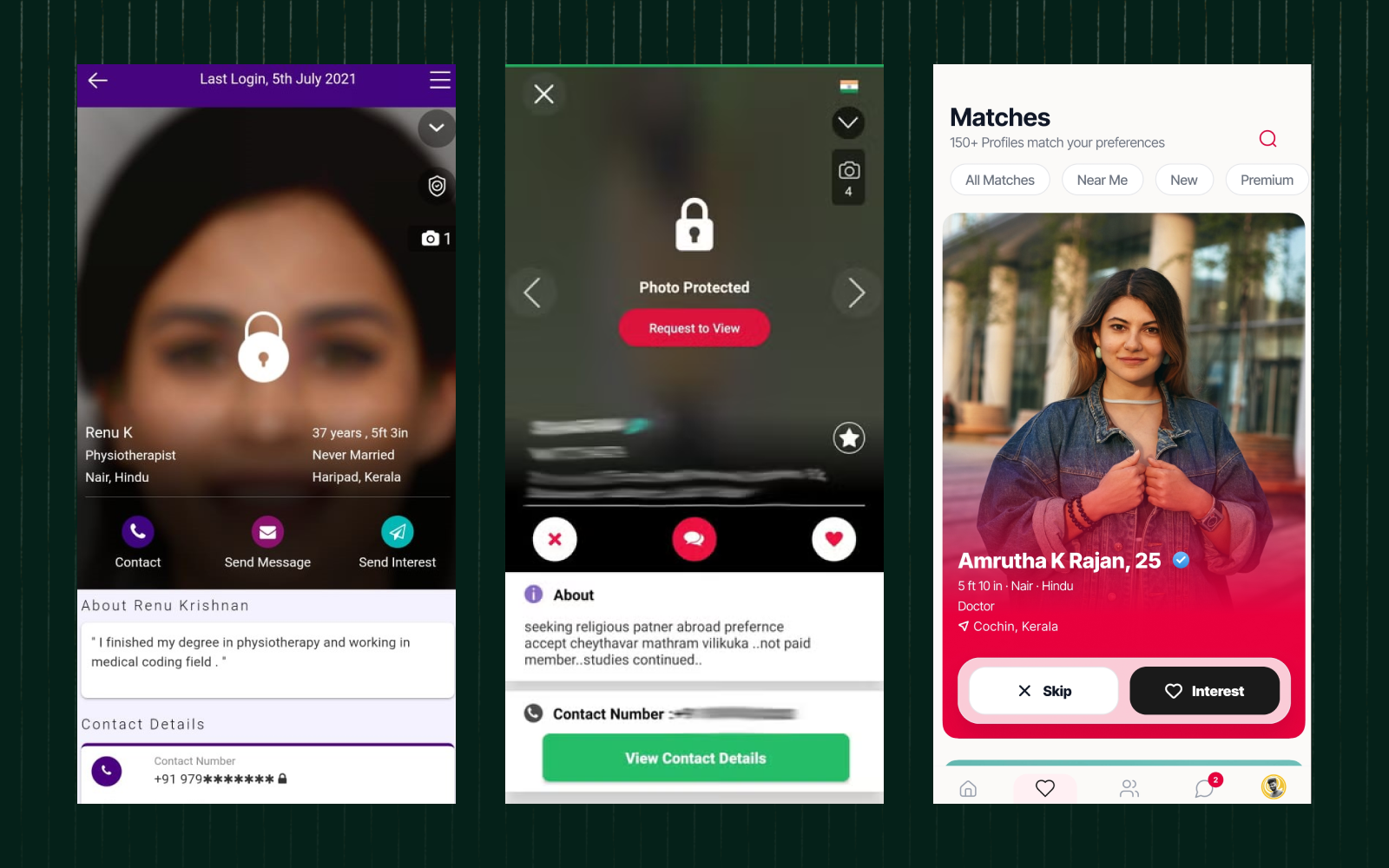
The existing options put photos front and centre, exposed profiles to anyone who signed up, and treated the process like a numbers game. Users didn't want more matches. They wanted fewer, better ones - and control over who could see them.
Who it's for
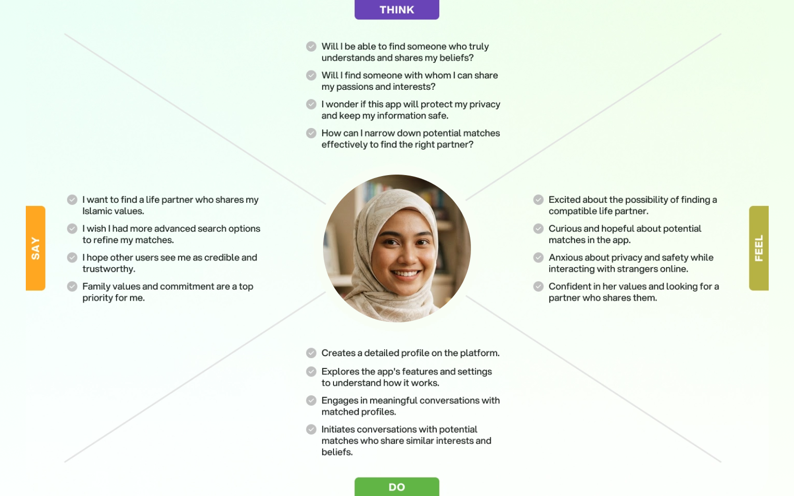
Muslim singles and their families in Kerala, searching with clear intent and real caution. Many were first-time app users for something this personal. The design had to feel respectful before it felt clever.
How I approached it
- 01User research and interviews to understand what actually stops people trusting a matrimonial platform
- 02Personas and empathy mapping across both the searcher and the family involved in the decision
- 03SWOT analysis of existing platforms to find where trust broke down
- 04User flows built around intent and verification rather than volume
- 05A visual system that reads as calm and considered, not transactional
The solution
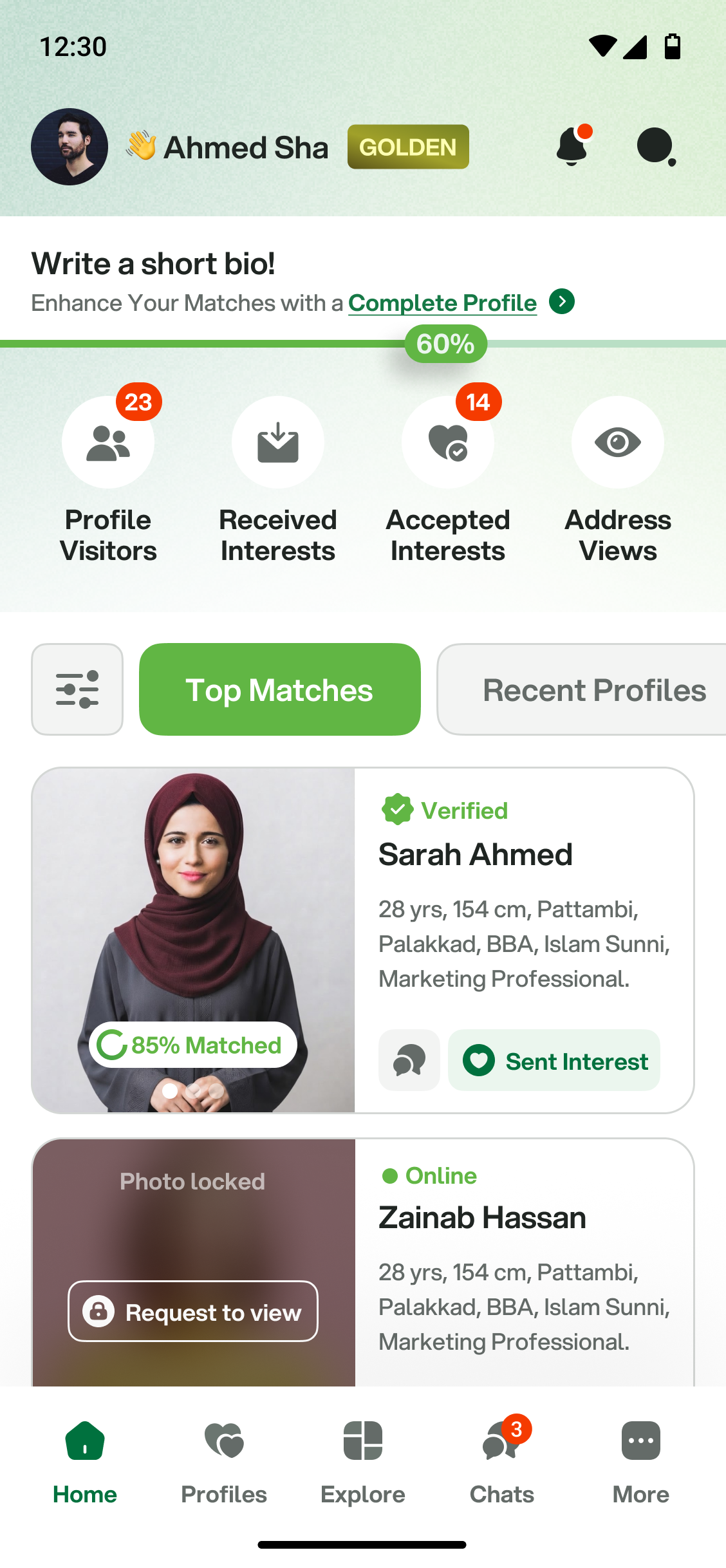
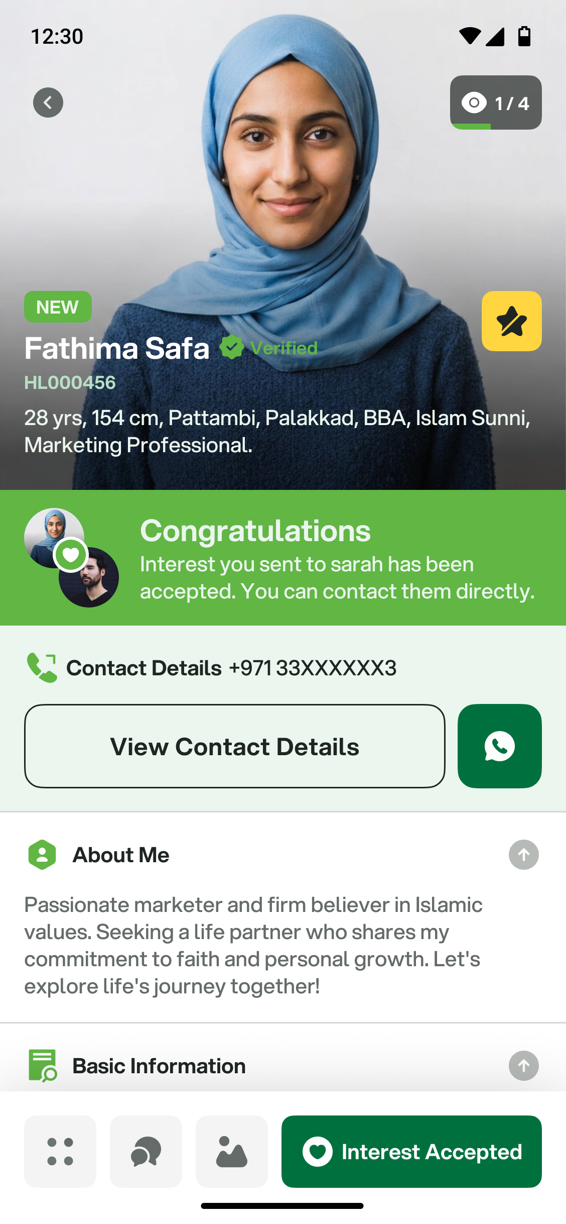
Privacy became a design principle rather than a settings screen. Profiles reveal progressively - the more mutual interest is established, the more is shared. Verification is visible and explained, so a badge means something to the person reading it.
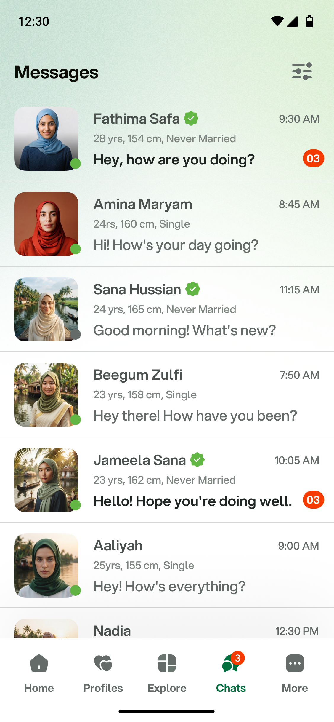
The visual language leans on soft greens and generous space: closer to a considered introduction than a marketplace. Photos matter, but they don't lead.
Decisions that mattered
- 01Progressive disclosure of profile detail - trust is earned in steps, not granted at signup
- 02Verification made visible and explained, so it carries actual weight
- 03No swipe mechanic - the interaction models intent, not impulse
- 04A brand system built on restraint, because the subject matter is personal
What I took from it
The interesting design problem wasn't the matching. It was designing for a decision people take seriously, in a category trained to make everything feel casual. Restraint turned out to be the feature.